Trends & Insights
07/02/2025
February 22, 2023

In this piece I am going to analyze Zendesk, a top B2B SaaS brand, pointing out what they do that is winning on their website and where there are potential opportunities to optimize.
Let's start with the homepage.
The first thing we see when we hit the page is a banner promoting a Masterclass, that sits right above their main navigation....

These tend to perform poorly on key pages (homepage, pricing etc). When it comes to your homepage, you want to push leads down the highest value paths and typically events, whitepapers or webinars reduce overall clicks to demos, trials, or your newsletter.
If you want to have these banners, the recommendation is to use them on blog, team, or other non-key pages.
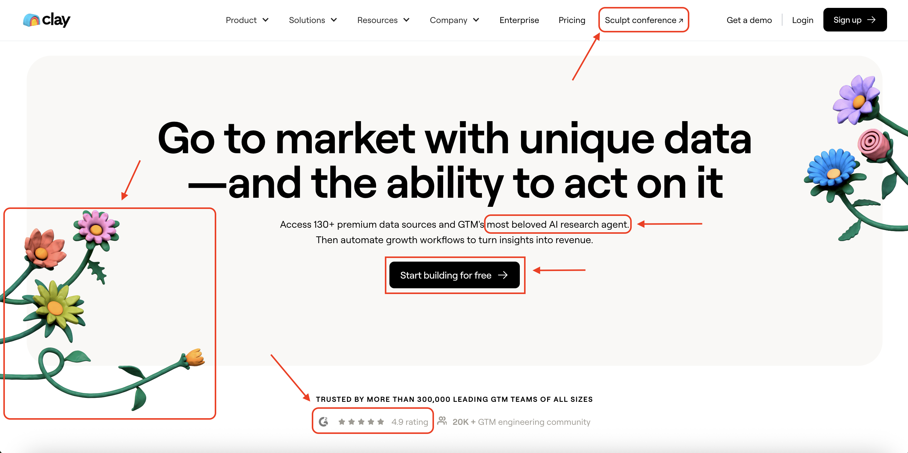
Next let's look at their hero, above the fold section.
There is a lot to unpack here...

Let's start with the good stuff...
Product imagery performs well. Especially in sectors like B2B SaaS or Fintech, we find that imagery of the actual product, performs well and beats out stock footage, brand imagery or other alternatives. So despite the fact they also include stock imagery around the dashboard, I think this is still a good bet here.
Embedded email capture wins: I have seen many brands, from Shopify to Ramp to Buffer to Rippling, test into embedded email capture. The idea is you reduce a click in the process by having it be embedded. One thought to improve this even more is to add re-assurance subtext below the CTA noting "no credit card" required. We find this works well for reducing friction with trials. See brands like Twilio that do this.
Two CTAs in the navigation is ideal: We find that 2 CTA's beats out 1 CTA both in the navigation and in the hero overall. The idea is you want to capture various levels of intent (someone who is ready to buy, wants to jump straight into a trial, whereas someone with less awareness might want to watch the templated demo video)
But now let's get to some challenge areas...
Scrolling logo bars perform poorly. I have written about this extensively, but logo bars are one of the most common misses for brands. They lack context, you can't engage with them, and brands are straining to find something relevant. Here is an in-depth look at why these typically lose in A/B tests.
If you are going to use logos, I recommend making them something you can engage with (like how Clay has case studies attached to their logos) or something easily segmentable by industry/type of logos (like how 7shifts does it)
Vague headline/subheader. The other challenge area is their header and subheader, which gives you that they use agents to provide customer service but that's about it. The header could be cut and pasted for any of their various competitors, and the subheader is odd with "powering over 10,000 AI customers". With a header/subheader you want to give a clear sense of what you do, and ideally include one aspect of what makes your brand unique versus the competition.
For example, at DoWhatWorks, we say "We track millions of websites daily to find winning A/B tests from major brands. The results are organized in a searchable database to help you spot trends and learn from your competition."
This covers both exactly what we do, and is something nobody else in the market provides.
Okay, let's continue on with Zendesk. If you want to signup for a demo, you get sent here...

Tests show that a slightly blurred background teasing next steps (or the product itself) performs well. We have seen brands like Ramp also test into this.
Tom, head of growth at Wiz, wrote a deep dive on the conversion lift of going from plain background to a blurred background on his blog.
On top of that the personalization options and progression bar also give clear expectations of what to expect (so many thing in conversion rate optimization come back to are you matching expectation to reality).
So great work here. Moving on down the homepage, we run into a banner of G2 badges. But there is one glaring problem...

The badges are from 2024. A big challenge with social proof overall, can be unintended signals.
Badges from a past year make the prospect think, "O, so you aren't the category leader this year?". It's the same with star ratings, if you have 4.8 stars but only 52 reviews, a prospect might think, "Why so few reviews?"
Similarly, when they use random number tiles a bit further down the page, prospects just gloss over these.

Instead, if you are going to talk about conversion lifts, revenue wins or time saving, contextualize it. A good example of doing it well is Stripe, who lays out even in the tile before you click in, exactly how they work with a big client.

Next, let's take a look at Zendesk's pricing page.
Zendesk does a lot of things well on this page.

AI language is focused on the output. When they say "AI agents available 24/7 to solve customer issues" that gives a clear sense of the output the agents provide. This is infinitely better than just saying you have agents, or that you are AI-powered, AI-first or whatever other general jargon.
Default annual (display monthly) is ideal. In 2025, this is a pretty standard best practice. You get more annual commitments, while keeping the price the lowest possible variation shown.
Button text is clear. Whether we are talking homepages or pricing pages, the key is don't be vague. Don't say "explore" or "continue" or "next". Stick to what clear language. "Get a trial", "book a demo", "buy now", "talk to sales".
_________________________________________________________________________________________________________________________________________________________________
If you want to see more analysis like this, we send out insights from top brands every Thursday via our newsletter.