Trends & Insights
7/16/2026
February 22, 2023
Over the last 12 months, I have had the privilege to sit down and chat with innovative website leaders at brands like Lovable, Ahrefs, Cisco, Adobe, Clay, Docket, Buffer, Glean, Zapier, Linear, etc.
They have been kind enough to get into the data with me, peel back the curtain, and share their expertise.
Combined with the expansive database of A/B tests we have here at DoWhatWorks, I bring you ten takeaways…
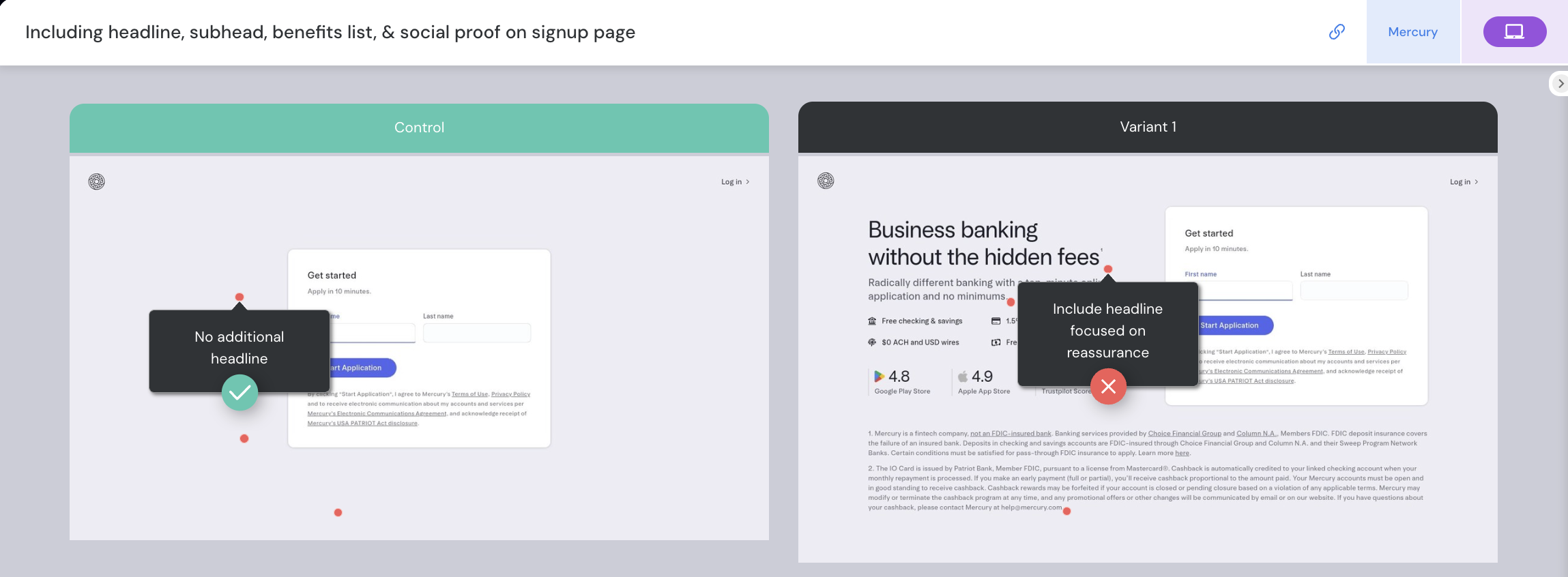
1) The changes that drove the biggest lifts in signup conversion shared a common thread: they simplified the path to account creation rather than trying to convince people harder. You can see this in the A/B tests on the signup page for brands like Mercury, Slack, Buffer, Zendesk etc..
The winning versions cut out the copy setting expectations and the social proof badges.
For a more expansive conversation on this topic, you can read the full interview we did with Buffer on the topic.
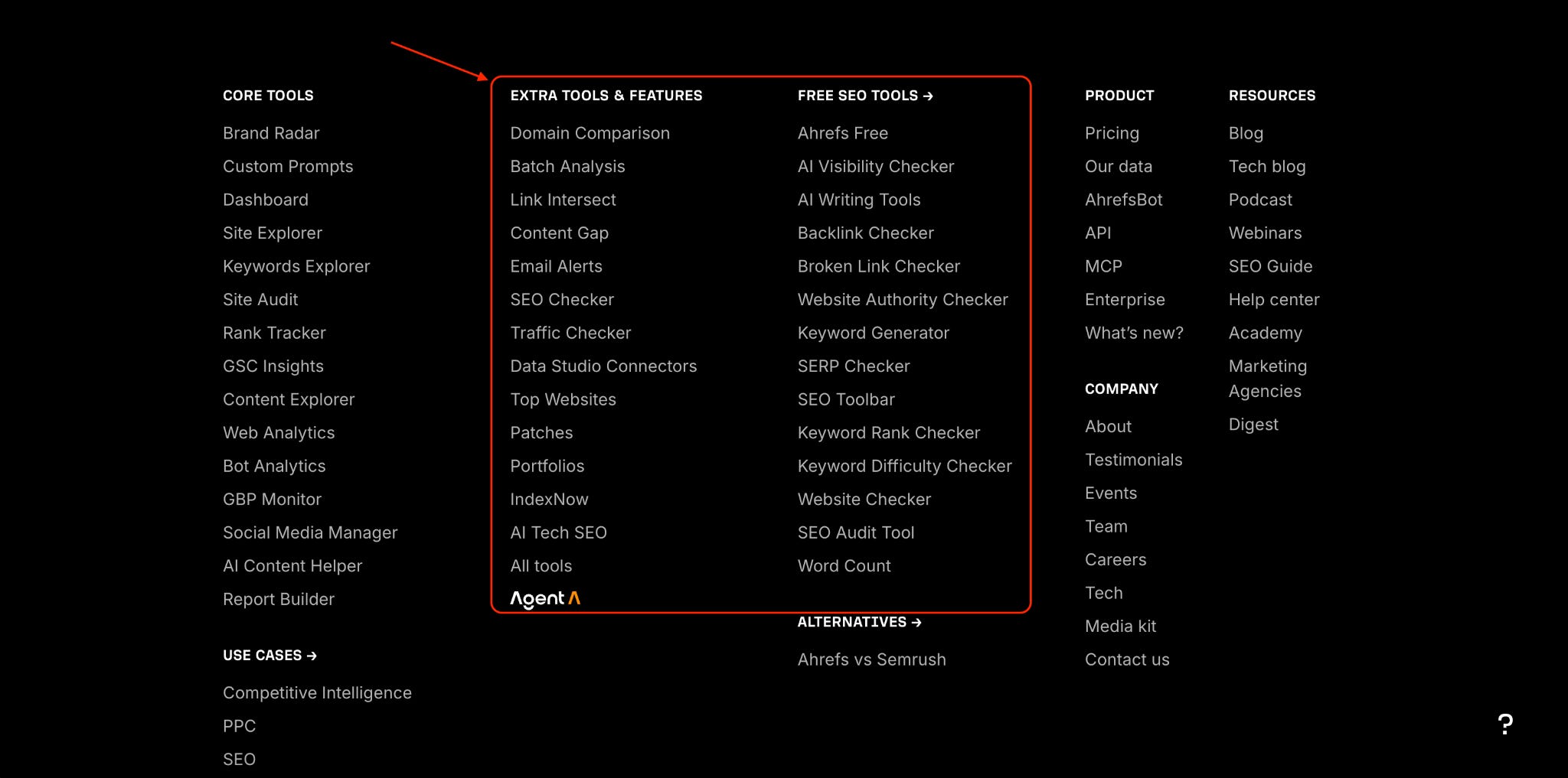
2) Having free tools listed in your footer can help with GEO. Here is the direct quote from Ahref’s CMO on this,
“For GEO purposes, launching quick, free tools (and having them curated somewhere on the site) can help shape brand narrative, especially for those trying to get a foothold in a market OR those who are pivoting to something new.
Vibe coding free tools can be a good way to test interest. It gets more eyeballs for our non-content core offering.
When the LLMs are crawling your site, they see that part of your product offering now includes xyz. Offering these tools for free increases the chances they’ll be mentioned or recommended by other happy users on social media or other websites, which in turn will reinforce to LLMs that your business model now includes xyz and is more diversified than what it was previously.”
For the full conversation with Ahrefs CMO you can read that here.
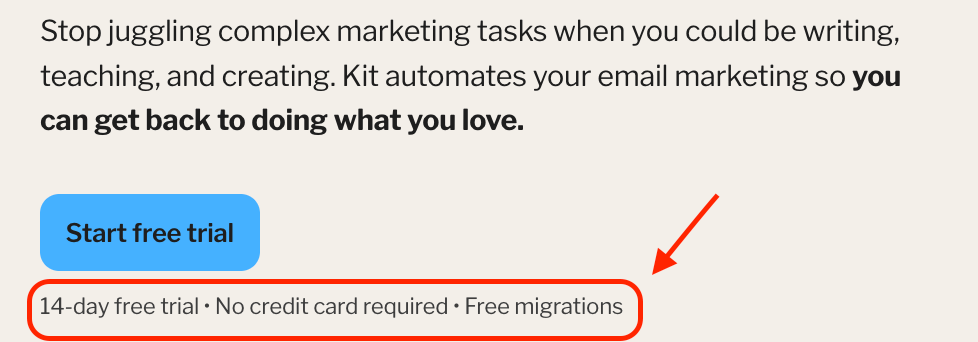
3) Reassurance subtext below CTAs performs well. “Free trial” or “no credit card required” are obvious ones, but brands like Kit include “free migrations” and brands like Zapier include specific enterprise security features, like “SOC-II compliant”.
4) Better expectation-to-reality in CTA buttons is one of the easiest ways to get a fast lift.
Good: “Get Demo”, “See Pricing”, “Start Free Trial”, “Read Research”.
Poor: “Learn More”, “Experience the magic”, “Spin it up”, “Amplify your reach” etc.
When we talked with the Glean team, they got a 100%+ CTR lift from replacing all instances of “Learn More” on their homepage with something more specific. You can see that conversation here.
5) Let folks self-select their path as soon as possible. Dozens of brands have A/B tested into persona-segmentation right under their hero sections.
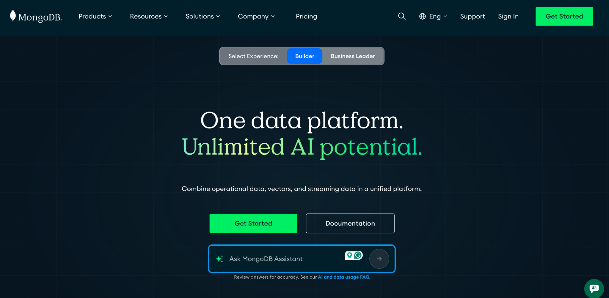
MongoDB and Sage have added “experience” toggles at the tops of their homepages towards the same end.
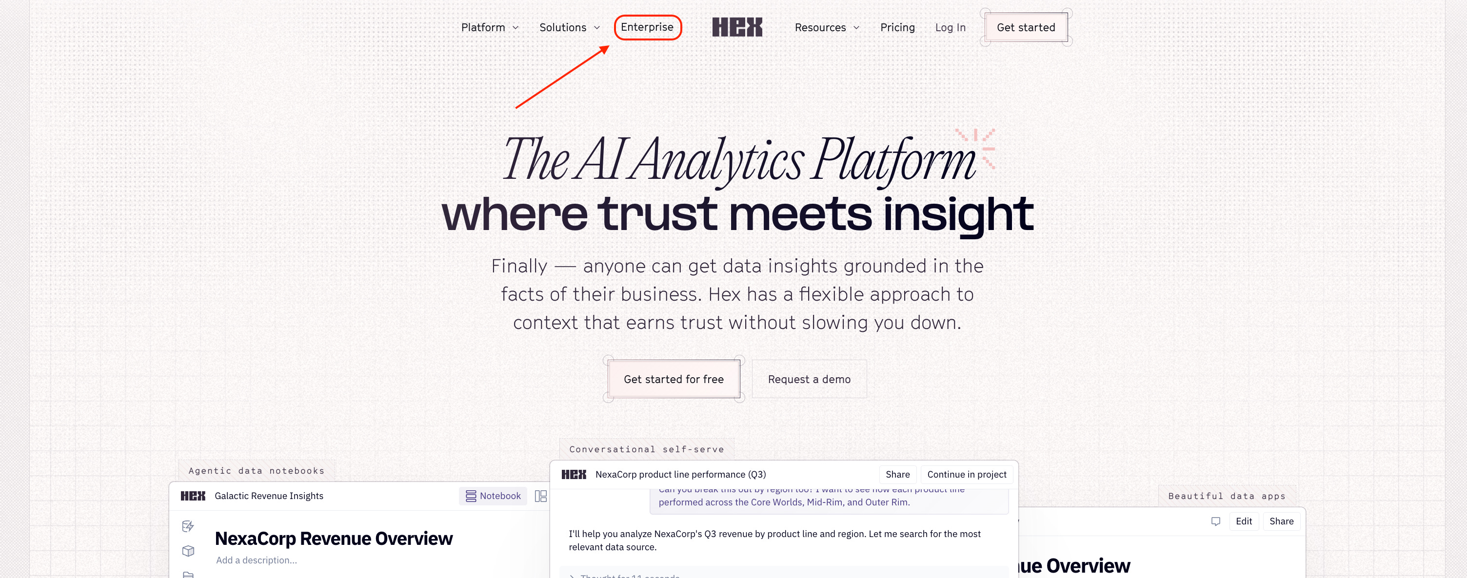
We also see test data that shows having a top nav option for “enterprise” wins, which signals the same principle.
6) Have comparisons between your SaaS and Claude Code / ChatGPT. Whether you are an email automation tool, a CRM, a project management platform, or a page builder, customers are now comparing you against the best vibe coding/no-code options.
We saw brands like Framer that implemented this comparison directly in their footer and had it ranking in major LLMs in under 30 days.
Glean also added comparisons to ChatGPT Enterprise and Claude Enterprise and it was quickly indexed and used in LLMs.
I wrote a post that shows how LLMs approach this brand-native content.
7) Agent accessibility matters. Agents often cannot access key site content hidden behind hover states, animations, or scroll-triggered loading. If important information only appears through dynamic interactions or forced scroll animations, both agents and users may miss it.
I wrote an in-depth piece on this here.
8) The bar for social proof is higher today. A good proxy for how valuable your social proof is: How easy is it to fake? We see case studies and video testimonials winning over logos or quote testimonials for this exact cost-signaling rationale.
You can watch a webinar we did with our friends at UserEvidence that shares dozens of A/B tests around social proof and what is working in 2026.