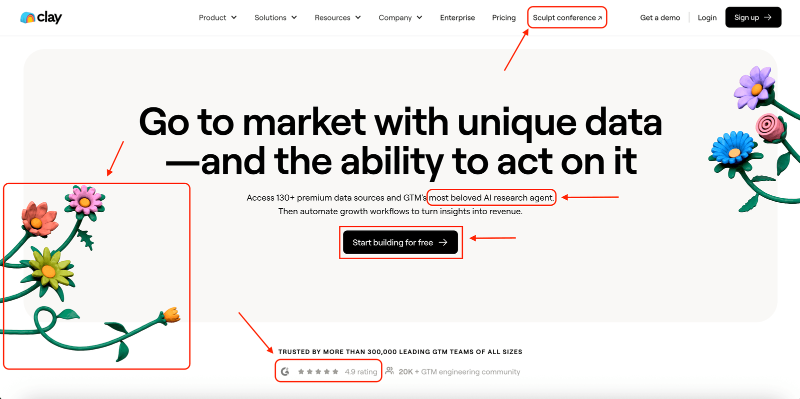
In this piece, I will do a deep dive website analysis of Clay, a B2B SaaS brand that has rapidly become a household name and seen meteoric growth.
I will use the DoWhatWorks database of tens of thousands of tests to guide my feedback on where Clay is showing best practices and where there is room for optimization. For the sake of this post not being twenty pages, I will limit the analysis to the homepage.
Off the bat, there is a lot to unpack above the fold.
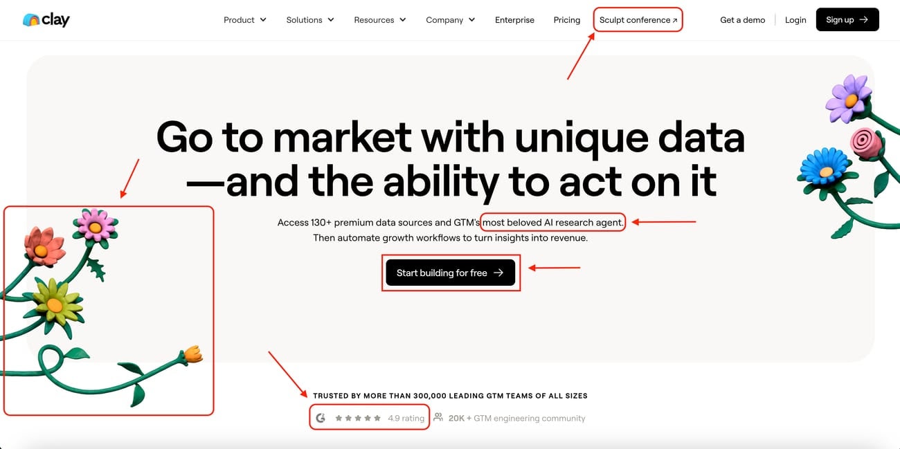
Linking the conference from the navigation instead of a banner.
We have seen dozens of brands testing having banners on their homepages, for events, for demos, for webinars, and typically these tests lose. A primary reason is that they reduce clicks to other CTAs more essential to the core buying journey.
While I do not know if having it in the navigation is winning, the data points to having it as a banner being losing, so this is likely a positive conversion decision.
Branded background imagery typically performs poorly.
It might seem generic, but there is a reason you see a high percentage of B2B SaaS and Fintech companies use product imagery versus stock photos, branded backgrounds or creative designs, and that is that product imagery wins in the majority of head-to-head split tests. Customers want a clear visual of what they are getting.
To Clay’s credit, they include lots of product imagery throughout the rest of the homepage, but not including it in the hero is likely a losing bet.
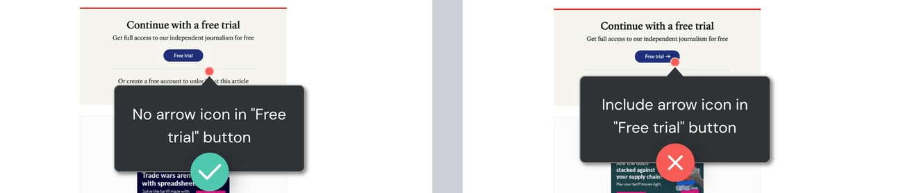
Arrow icons in CTAs typically lose.
This is a small detail but nonetheless worthwhile noting. Plain text CTAs tend to beat out CTAs with a directional arrow. Below is a test from The Economist on this exact thing.
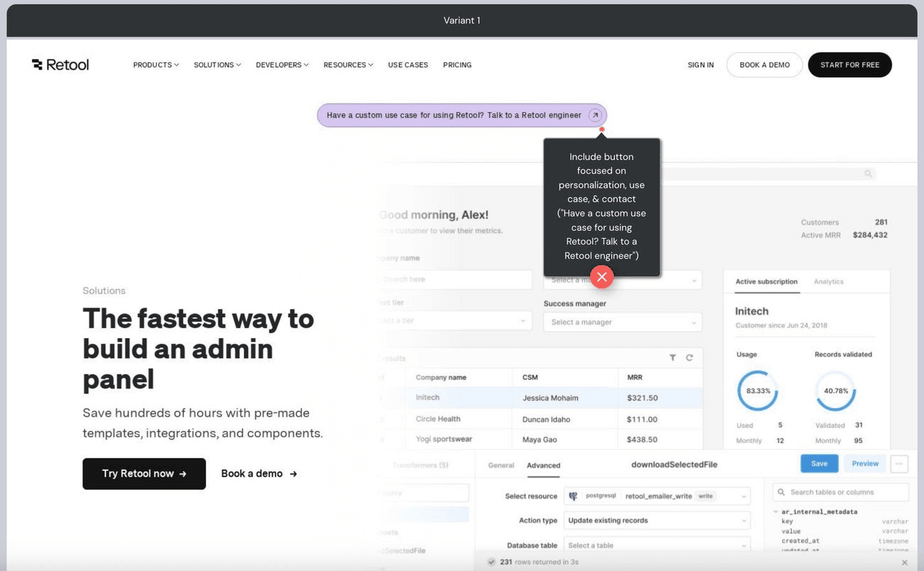
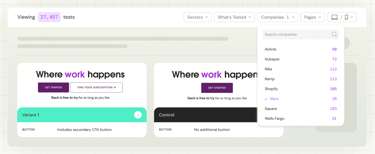
Single CTAs in the hero typically lose.
For brands whose traffic comes from multiple sources, say paid, influencers, social, events, they arrive at the site with varying levels of understanding of the product and intent. As a byproduct, it is typically ideal to have a pathway for high intent users, like a demo, as well as for lower intent users, like a product walkthrough or trial.
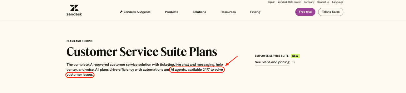
General AI positioning tends to lose.
How brands talk about AI and how customers perceive it is continually changing. What we see typically win is AI verbiage that talks about the output, where general framing of “AI powered”, “AI first” or “beloved XYZ agent” tends to lose when tested.
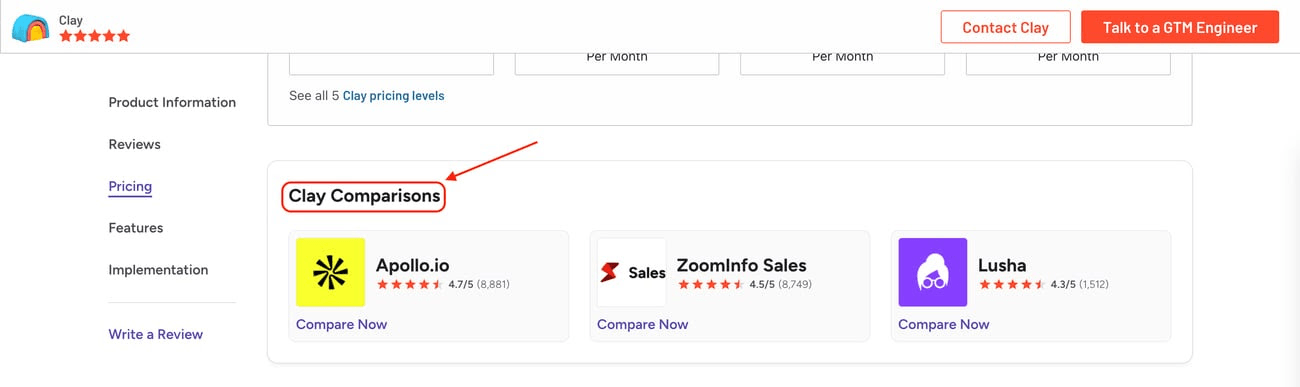
Linking out to G2 reviews is likely a bad bet.
While Clay has great reviews and overall rating from their customers, one hurdle with directing customers to this page is that G2 directly links to competitors, and this might add additional competitive considerations that the prospect was not considering before.
In many tests we have seen around adding G2 reviews in the hero, or on signup pages, or on pricing pages, they lose to the controls.
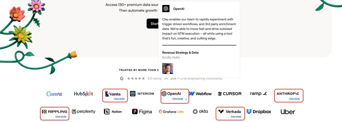
The logo bar carries case studies, which most do not.
Typically logo bars perform poorly as they are static, with no ability to get context on whether the logo’s implementation was relevant to the prospect. But Clay adds case studies directly to a handful of their logos, adding context and depth. They even have nice hover animations to preview the customer stories.
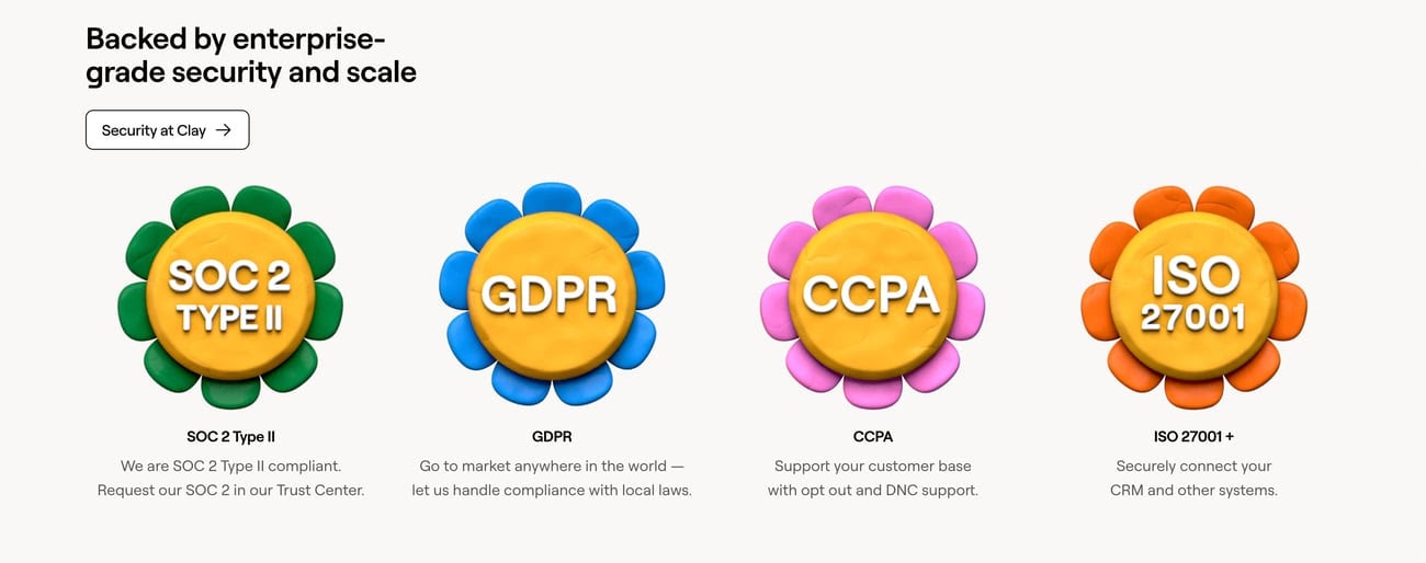
The security section does double duty.
Continuing down the page, after a few blocks explaining how Clay works and showing case studies, which are clear and well executed with GIFs and product shots, we land on this security section.
This is not only a typical element for targeting enterprise customers but also brings in Clay’s consistent brand identity with the clay style imagery and color scheme. It is memorable and creates recall to Clay specifically.
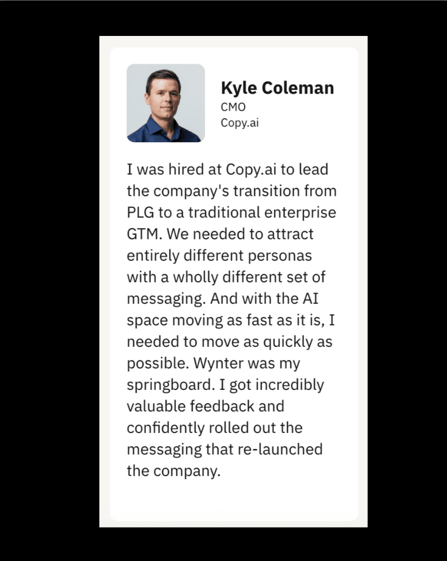
Generic testimonial blocks typically underperform.
The testimonials I see winning in A/B testing are testimonials with specific before and after transitions, and those that create a lot of affinity with the buying persona.
The branded background works at the end of the page.
Clay ends the page with a nice branded background. While branded backgrounds tend to lose against product imagery in the hero, in other locations they are great for creating brand recall.
Reassurance text next to the trial.
The other small detail which is best practice based on the data is the reassurance text next to the trial, “no credit card required”. We have seen many brands from Shopify to Twilio display this copy on their sites.