Casey sat down with Simon Heaton, Director of Marketing at Buffer, and went through their website experiments for 2026.
One pattern ran through everything they told us, and it is stated plainly enough to quote: removing friction consistently outperforms adding persuasion.
Their highest impact experiment was deleting an entire page.
“Our highest-impact experiment was cutting an entire page from the signup flow,” Simon said. “We were routing people from the homepage to the pricing page before signup, and 57% dropped off between those two pages.”
“Sending them straight to sign up led to a 17% signup conversion lift, so pretty sizable as an outcome from a single test.”
Full redesigns of the homepage and pricing page both shipped as wins.
“Simplifying page design and messaging was the next biggest theme. Full redesigns of both the homepage and pricing page — focused on clarity, transparency, and reducing the number of decisions a visitor has to make — both shipped as wins.”
Swapping illustrations for real product screenshots improved conversion.
“Broadening our hero copy to speak to a wider set of use cases, and swapping illustrations for real product screenshots also improved conversion.”
Replacing a visible CAPTCHA with an invisible one lifted completions.
“Removing technical barriers made a difference too. Replacing a visible CAPTCHA with an invisible one on the signup form directly improved completion rates.”
Get started for free beat Get started now.
“Even micro-copy changes mattered; switching our CTA from ‘Get started now’ to ‘Get started for free’ won because it lowered the perceived commitment.”
Adding persistent banners on blog pages lost.
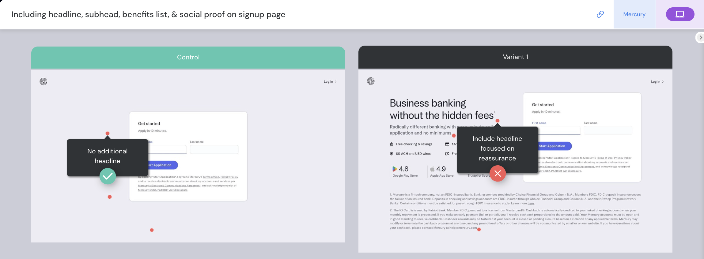
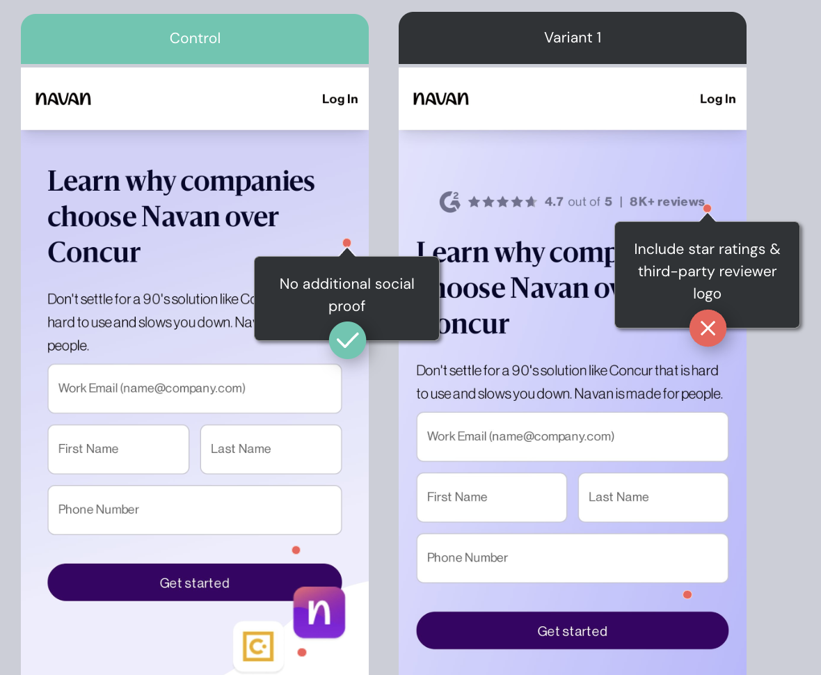
“What didn’t work is equally telling. Adding persistent banners on blog pages, social proof on the signup page, and defaulting to higher pricing tiers all lost.”
Adding social proof to the signup page lost.
“The lesson: once someone is in the signup flow, they’ve mostly decided. Extra elements at that point are noise.”
Casey: Our data here at DoWhatWorks follows many of the patterns that Simon shares in their data. We also have data on tests around additional social proof losing on sign-up flows, and banners losing on both blogs and homepages in A/B testing.
Defaulting to higher pricing tiers lost.
“So the lesson for us has been pretty simple: subtract before you add.”
Support gets homepage real estate, not a footer link.
“Everything on our homepage has to earn its spot, and support consistently does. Users tell us all the time that support is one of the reasons they choose Buffer and stick with Buffer, so we treat it like a real product differentiator, not just a post-purchase function.”
“We’ve always taken a very human approach here. We used to call our customer advocacy team the ‘Happiness Heroes,’ which says a lot about the philosophy. The photos on that section are real team members, not stock images, and many of those folks have been with Buffer for 10+ years.”
“What’s interesting is that support doesn’t just solve problems for us, it drives retention. We regularly maintain a 95%+ happiness score (CSAT), and customers often come out of support interactions feeling even better about Buffer than they did before. That’s why it gets homepage real estate. It’s one of the clearest examples of what makes Buffer different.”