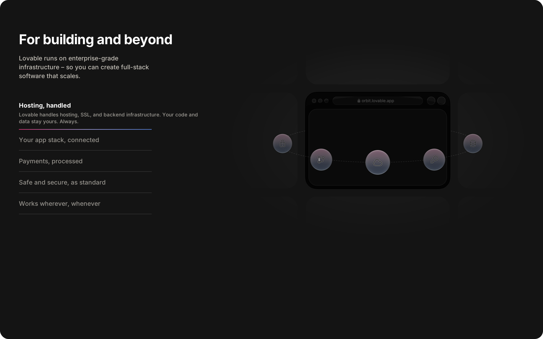
Lovable has been minimalist since inception: an intake box in the hero, then templates, and that was it. Last month the site grew customer logos, a how it works section and a second input block at the bottom.
Elena Verna, who heads up the website, explains what changed and why. None of this is reported as measured split test results, so we read the verdicts here as likely wins based on the outcomes she describes, the same way we would grade a teardown of our own.
The hero to templates flow was bottlenecking first-time users.
“Yes, very intentional as we move towards mass market,” Elena said. “As Lovable matured, the old ‘hero → templates’ flow started to bottleneck first-time users who didn’t yet know what they wanted to build.”
“We added social proof and a lightweight ‘how it works’ layer to reduce anxiety and answer our two biggest questions upfront: is this legit, and how does this actually work.”
A second CTA block leading with No-code app builder.
“Yes, that’s deliberate. Part SEO, part clarity. Many users don’t arrive knowing what ‘vibe coding’ means. Anchoring Lovable in a category people already search for helps discovery and sets expectations.”
“But we are not leading with it, on purpose. Once they’re in, the product experience does the differentiation work.”
Note from Casey: I covered how some smaller “no code” brands like Bubble have been performing well in GEO due to lots of their content specifically structured around that category. Replit and Lovable now both feature “no code” directly on their homepage as of Feb. 1st, 2026.
A growing majority of new users start by typing, not navigating.
“You’re right that this is where websites are going. A growing majority of our new users now start by typing what they want to build rather than navigating pages. That path has the highest activation rate and fastest time-to-value.”
“Tabs like Resources, Community, and Solutions still matter, but they skew toward evaluators and the latent majority.”
“The ‘tell us what you want, we’ll take it from here’ flow is the front door.”
Gift cards, which almost no other B2B SaaS brand offers.
“Lovable unlocks new capabilities that people want to share proudly with others. It is already shared via WOM socially, but we have people buying gift cards to let friends ‘just try it’.”
“It was a user-requested feature that is getting steady use (released over holidays!). It also aligns with how Lovable spreads: through experimentation, side projects, and word of mouth, not top-down sales motions.”
Speed matters more than completeness.
“Speed matters more than completeness. We bias toward getting people building and seeing that first preview, not explaining everything. The product is the best marketing asset. The site exists to get out of the way as fast as possible.”
“We treat the homepage less like a brochure and more like an on-ramp. Every change is measured against activation (first few prompts), not time-on-site or sign-ups.”