Glean is an enterprise search and knowledge management platform founded in 2019, now carrying a $7.2 billion valuation.
Casey sat down with Daniel Henderson, their head of digital, to unpack what has been working on the website and what came out of their CRO experiments.
They built the integration section as an interactive experience.
“One area where Glean assessed a big gap on its site was its lack of an integration section. Major competitors had these to show compatibility, but Glean didn’t have a dedicated homepage integration block.”
“While having an integration section (especially in enterprise) is a no-brainer, the data shows that for at-scale SaaS and fintech brands, the typical integration section that links out to another page gets less than 0.5% of homepage clicks. So Glean decided to build an interactive experience.”
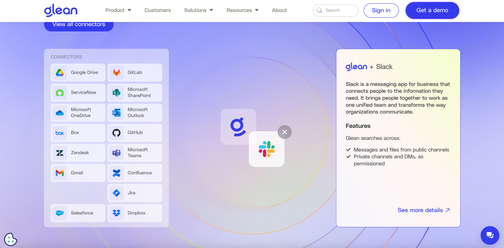
“In their integration section, you can drag any of their connectors, and it shows you exactly how Glean works with that platform. For the 20-30% of the website traffic that makes it down this far on the page, they average 4 events (or interactions) at this section, which is dramatically higher engagement than normal for an integration section.”
A highlighting animation around the sticky nav demo CTA.
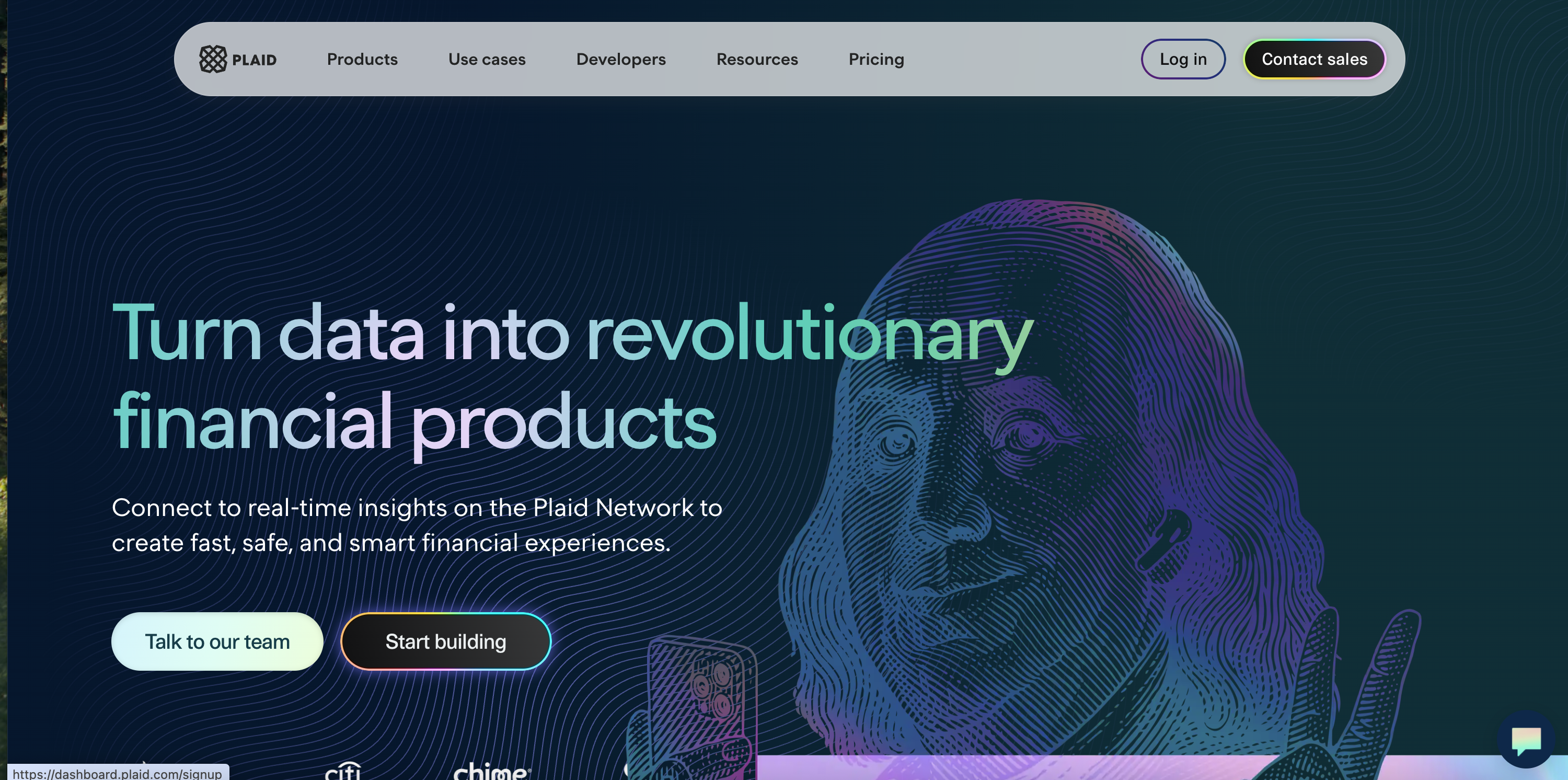
“Glean pulled off one of the most remarkable lifts I have seen on a primary navigation CTA. By adding a highlighting animation around the ‘Get a Demo’ CTA that is part of the sticky top navigation bar, they got a 70% lift in Click-through-rate. Not +.7%. Not +7%. Seventy percent lift.”

“It shows that visually differentiating CTAs on a busy page can draw folks to that action, and other teams, like Plaid, have also had success with visual hover effects on CTAs.”
The banner primes the visitor, the section below it converts.
“Next, we dip into psychology, where Daniel explains how they have found success promoting their virtual events from the homepage. They start by priming the user with a first exposure to the virtual event in the top banner. They then follow with a dedicated media section below.”
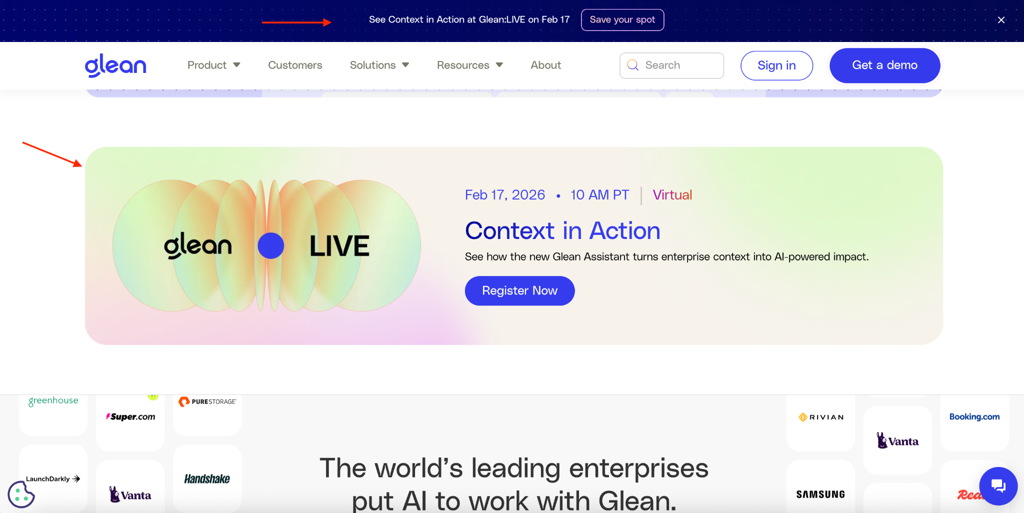
“While our data at DoWhatWorks shows that top banners, in general, perform poorly in SaaS and fintech, the idea of the banner as being less focused on clicks and more as a visual primer for a follow-up touch further down the page is clever, and glad to see this worked for the Glean team.”
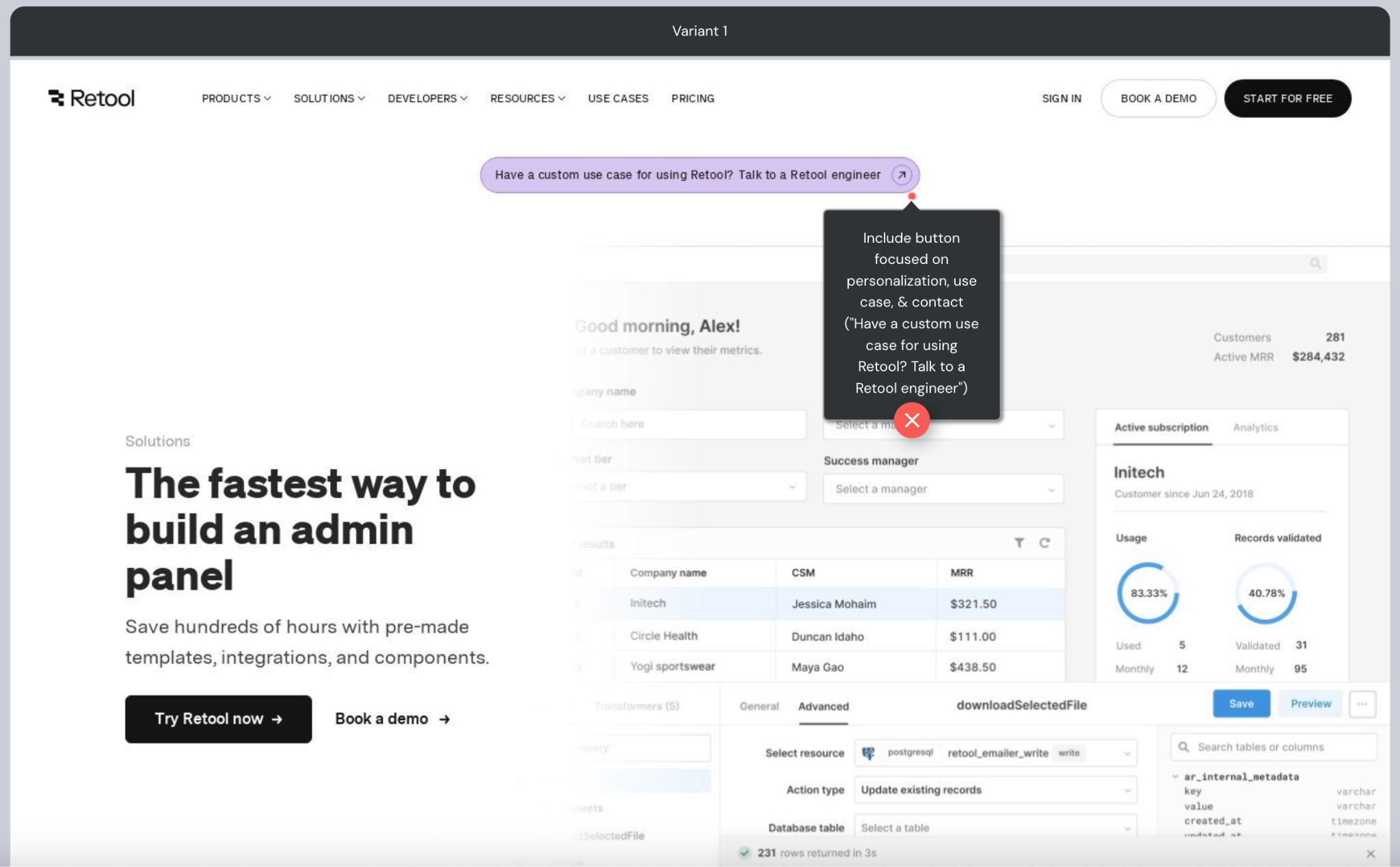
They replaced all Learn more CTAs with specific ones.
“The biggest overall lift of any major site change for Glean was actually a stunningly simple one. They got a 166% CTR lift by doing something any brand reading this can go change on their own site in 5 minutes: they cut out all their ‘Learn more’ CTAs and replaced them with specific, clear CTAs.”
“The rule of thumb for CTAs is simple: what do I expect is going to happen next when I click this button? If it’s clear, you win. If it’s not, you get high bounce and fall-off. ‘Learn more’ or ‘get started’ are not clear CTAs. Get a Demo. See Pricing. Talk to Sales. See Integrations. Those are clear CTAs.”
Works
- Get a Demo
- See Pricing
- Talk to Sales
- See Integrations
Does not
- Learn more
- Get started
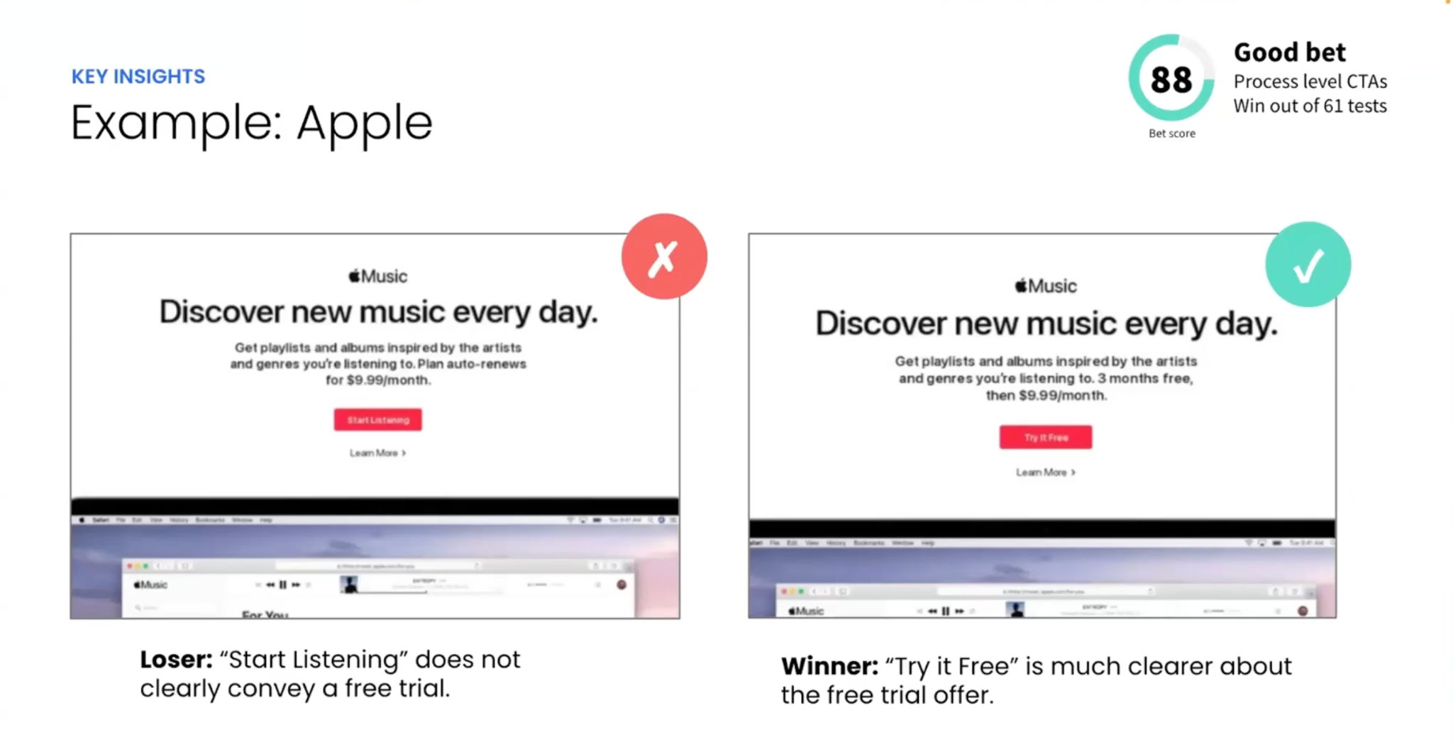
“Apple, for example, tested ‘Start Listening’ vs. ‘Try it Free’. ‘Try it free’ won because ‘start listening’ didn’t actually lead to just listening to the music. It led to a trial form before you could start listening.”
Department segmentation beat industry segmentation.
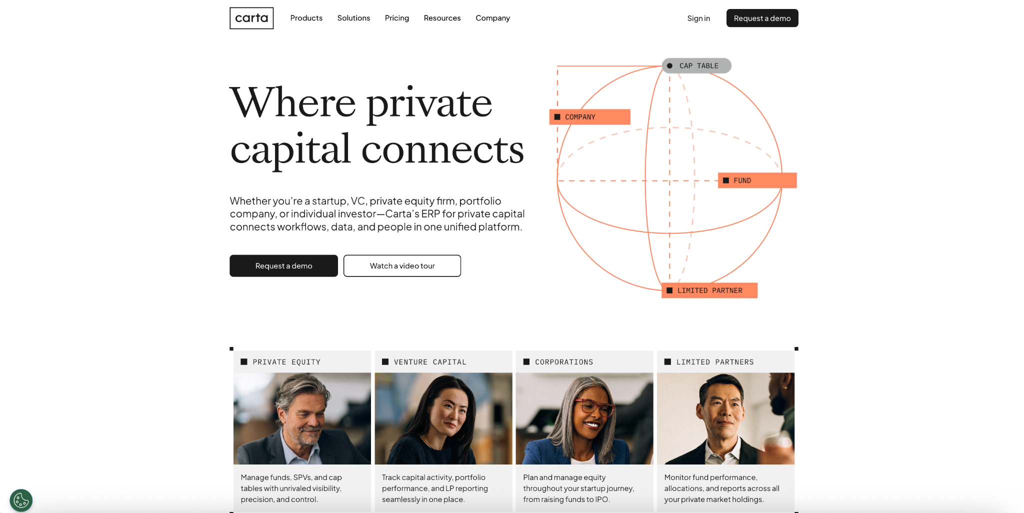
“One common question I get asked by brands is should I segment by industry? By role? By department? By size? Glean segments by both department and industry, but was clear which path had the most engagement: department, by far, had the most resonance.”
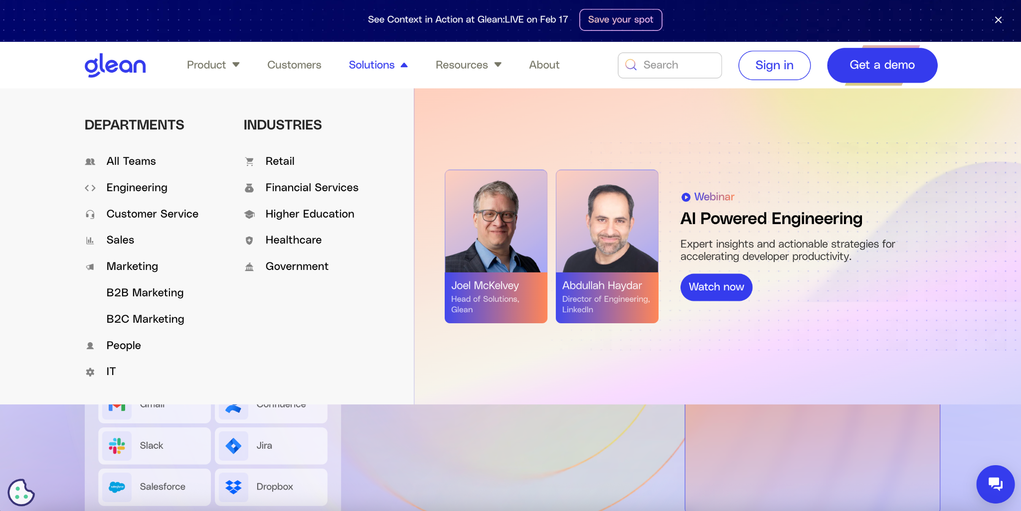
“Prospects want to see the impact on them, in their department, in their role. How are they going to deliver a win for their organization? They show this persona segmentation right below their hero, too, because it’s one of the key places traffic engages.”
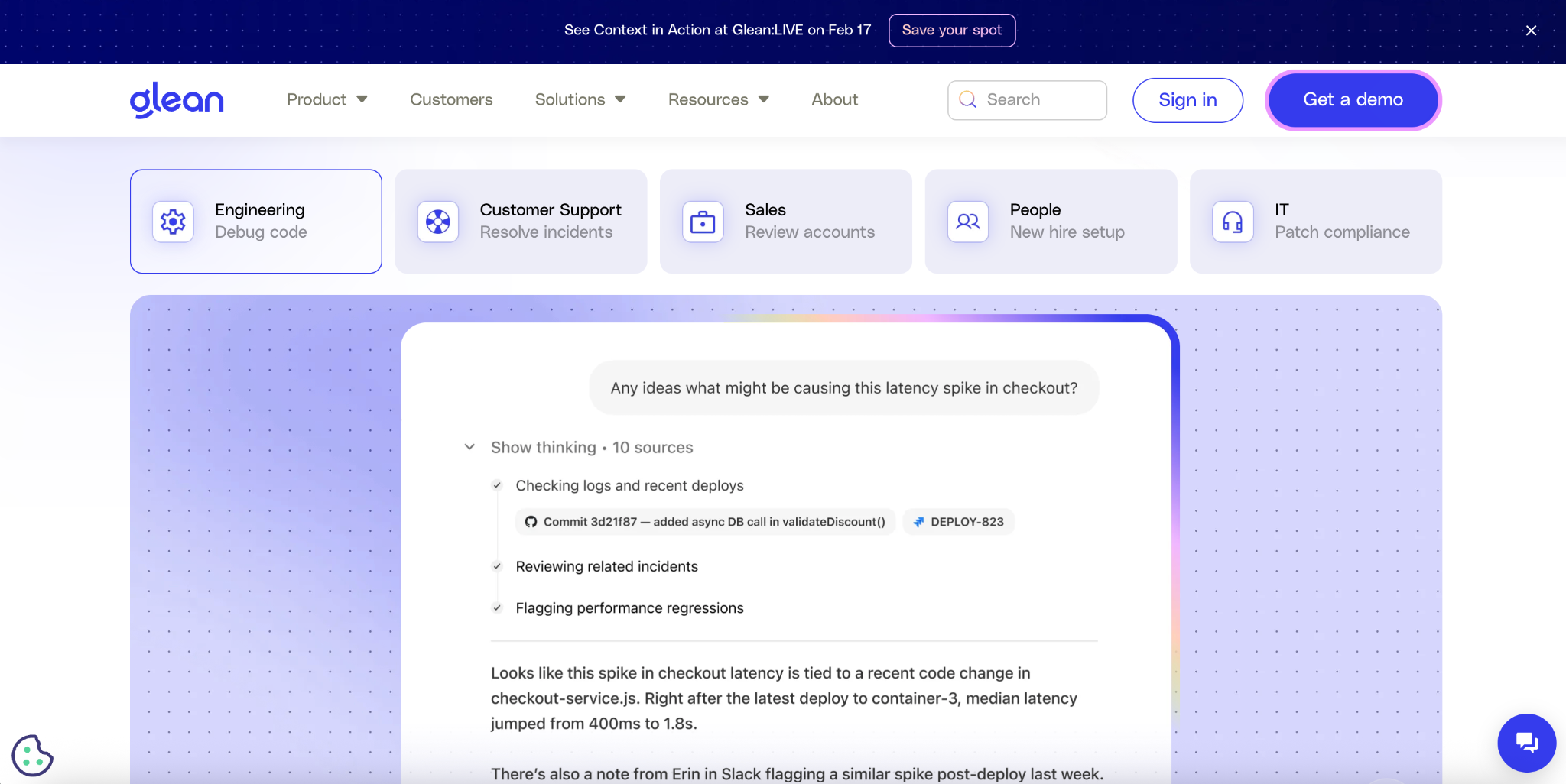
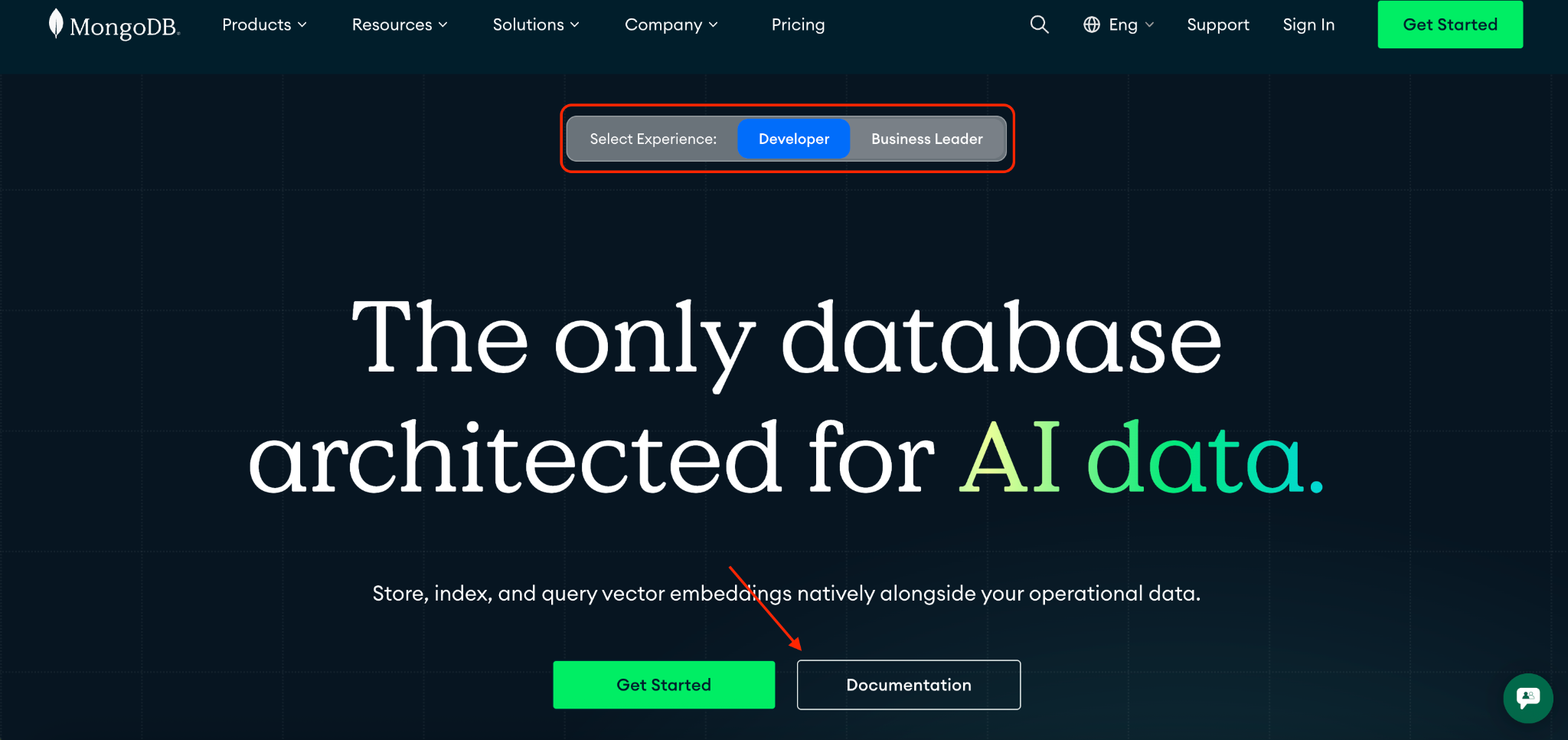
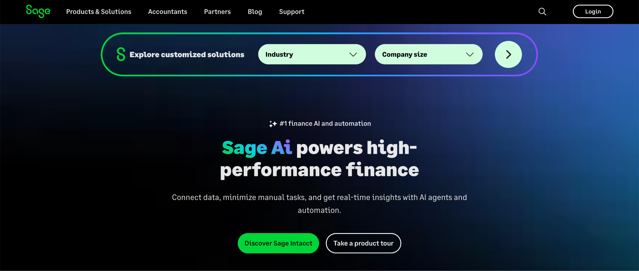
“This is part of a much larger trend in SaaS and fintech of brands moving persona sections further up on the page. Carta redid their homepage, and now theirs is also right below the hero. Brands like MongoDB and Sage have even moved to add personalization by persona options at the very top of the homepage hero.”
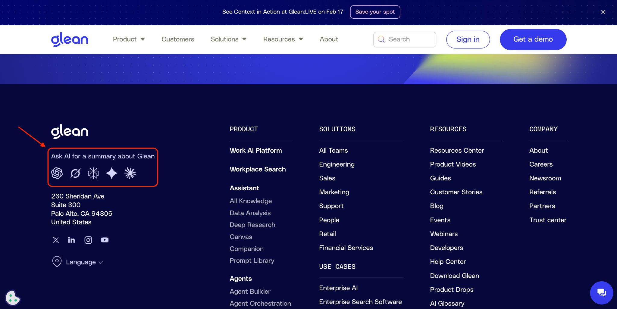
A summarize with AI option in the footer, using prompt prefills.
“As an innovative brand, Glean is constantly experimenting and testing around AI. One area they just launched on the site a few weeks ago is having a ‘summarize with AI’ option in the footer, using prompt prefills.”
“The idea of these sections is two-fold: by controlling the prompt, you control the narrative of how a third-party environment talks about you. You can set what reference material to use too. The standard format seems to be ‘As a [persona], trying to solve [insert usecase], explain how [our company] solves for this. Use [insert homepage or relevant reference pages] to provide the answer.’”
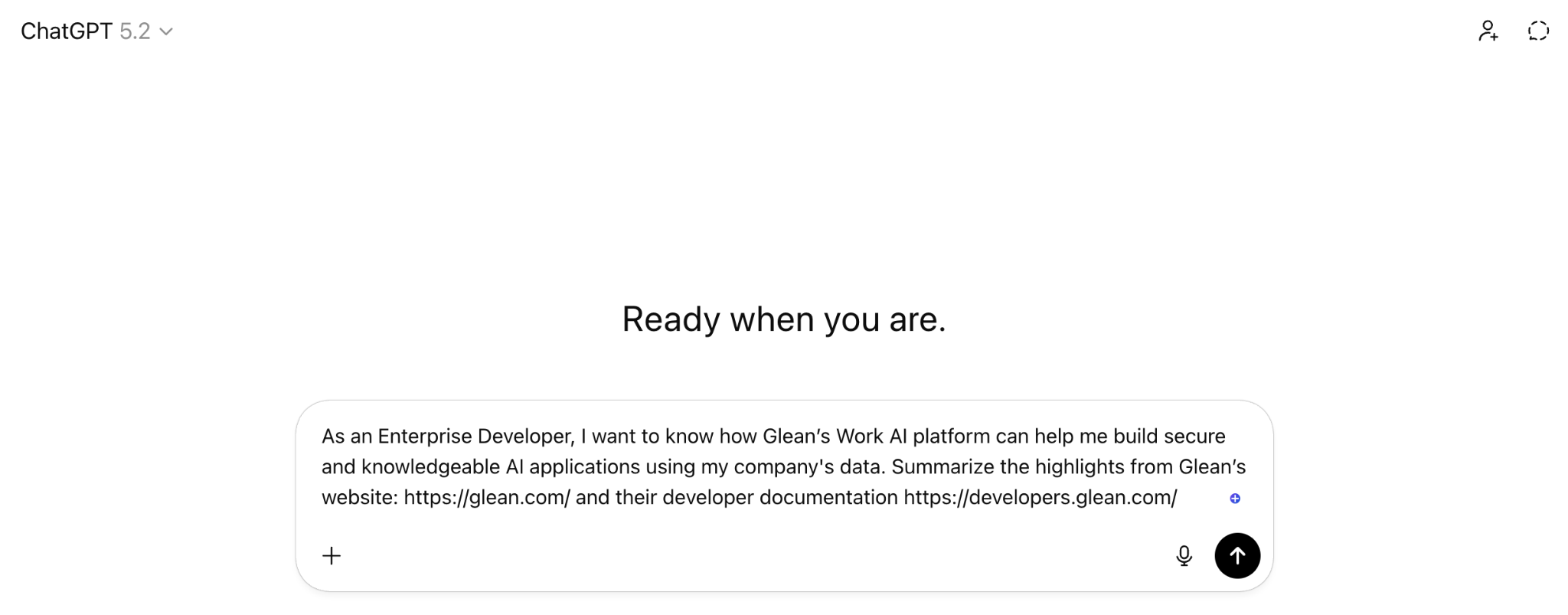
“There could be a longtail effect here. By adding this prompt into the prospect’s local LLM instance, the chances they cite that brand in the future may be higher. It’s too early to assess the impact of this section yet for Glean, but I love to see the experimentation mindset.”
Daniel notes that a lot of brands are leaving money on the table by not investing in CRO, stating, “Your website is your 24/7 salesperson. Make sure it’s optimized.”